What Happens When You Explore Canvas Prints Options
Introduction: Why Canvas Prints Matter and How This Guide Works
Canvas prints sit at the intersection of photography, painting, and interior design, turning pixels into textured, room‑defining statements. They mute glare, soften contrast, and bring a tactile quality that framed paper often can’t match. Whether you’re outfitting a studio, refreshing a living room, or preparing client gifts, getting started with Canvas Prints can feel surprisingly approachable once you know which levers to pull: fabric, ink, size, finishing, and display. This article breaks down each choice with practical steps, trade‑offs, and real‑world examples so you avoid guesswork and end up with wall art that holds up over time.
Here’s the outline you can follow as you read, skimming or diving deep as needed:
– Materials and print technology: canvas weaves, coatings, and inks, plus why they influence color and longevity.
– Sizing and file preparation: resolution, sharpening, color space, and aspect ratio for crisp, faithful output.
– Finishing and display: edge styles, stretcher bars, frames, and hanging hardware tuned to your space.
– Quality and purchasing: inspection checklists, shipping considerations, and durability signals to trust.
– Value and sustainability: cost drivers, comparisons with other print types, and care that extends lifespan.
Relevance matters. Canvas prints are common in homes, galleries, offices, cafés, and rental properties because they balance visual warmth with practical durability. They’re lightweight compared to glass‑glazed frames, resistant to minor fingerprints, and forgiving of subtle surface scratches thanks to their texture. For small spaces, a single gallery‑wrapped panel creates a focal point without clutter; for larger rooms, multi‑panel grids or panoramic spans build rhythm and scale. Throughout this guide, you’ll see where to spend for noticeable gains and where modest options perform well. Think of your project like curating a playlist: pick the right format for the vibe, sequence elements with intention, and let the medium amplify your story.
Materials, Inks, and Fabric Weaves Explained
At the core of any canvas print are three elements: the fabric, the coating, and the ink. Fabric typically falls into cotton, polyester, or blended weaves. Cotton (often 100% cotton duck) offers a natural texture and a subtle matte that many photographers and painters appreciate. Polyester tends to yield a slightly brighter surface and can produce punchier color because of how inks sit near the top of the fiber. Blends aim for a middle ground: improved color uniformity without losing too much organic character. Typical weights range from roughly 300 to 450 gsm; heavier canvas can feel more substantial on the wall but isn’t inherently more durable unless paired with quality coatings and a stable frame.
Coatings do quiet but essential work. An ink‑receptive layer improves color density and detail, while a protective varnish (or factory top‑coat) can add abrasion resistance and marginal UV protection. Some canvases include optical brightening agents (OBAs) to look whiter; they can enhance perceived contrast but might shift in tone under certain lighting over time. If your décor depends on consistent neutrals, an OBA‑reduced or OBA‑free canvas is worth considering.
Inks complete the triangle. A common approach is pigment‑based “giclée” printing, prized for stable color and fine gradations. Dye inks can offer broad gamut on some materials but generally trail pigments in fade resistance. Latex and UV‑cured inks appear in large‑format environments; they can be durable and scuff‑resistant, though the surface look may differ from water‑based pigment outputs. Many pigment systems, paired with quality canvas and indoor display away from direct sun, are rated by manufacturers and labs to retain color for several decades—often 70 to 100 years or more—though your conditions (light, heat, humidity) matter.
Wood matters too. Kiln‑dried stretcher bars reduce warping. Common depths are about 0.75 inch for a low‑profile look and 1.25 to 1.5 inches for a bolder presence. Look for tight, even staples and corner keys (little wedges) that allow future retensioning. Among the common mistakes beginners make are choosing a thin, non‑kiln‑dried frame that twists, ignoring OBAs when matching neutrals to existing décor, and assuming the heaviest canvas automatically signals superior longevity. A smart path is to balance weave, coating, and ink system for your exact setting rather than chasing any single specification.
Quick material cues you can use when comparing samples:
– Feel the surface tooth; a consistent texture often reflects even coating.
– Check the back for clean folds and tidy staples; craftsmanship here mirrors front‑side care.
– Ask about ink type and any published permanence testing; transparent policies are a good sign.
Resolution, Color, and File Preparation for Sharp Results
Great output starts before a single drop of ink hits canvas. Because canvas softens micro‑detail compared with glossy paper, you can often print larger than you expect—with sensible prep. As a rule of thumb, aim for about 300 ppi at small sizes viewed up close (e.g., 8×10 inches), 180 to 240 ppi for mid‑size prints viewed at arm’s length, and around 120 to 180 ppi for large statement pieces that people see from a few feet away. These are viewing‑distance guidelines, not rigid laws, and good interpolation can gently bridge gaps.
Color management helps maintain intent. Working in sRGB is a safe default for most labs; it reduces surprises on saturated reds and greens compared with unmanaged files. If you work in a wider space like Adobe RGB, embed the profile so the printer can convert predictably. Soft‑proofing with a matte‑canvas profile (if provided) previews how blacks lift and highlights compress on a textured surface; subtle midtone contrast adjustments often recover perceived “snap.” Apply output‑specific sharpening as a final step—enough to restore edges without creating halos. Save high‑quality JPEG or TIFF, keep layers in a separate master file, and verify that the aspect ratio matches the intended dimensions to avoid awkward crops.
Practical workflow moves—simple setup tips that help—include calibrating your display monthly, viewing at a moderate luminance (around 100–120 cd/m²) to avoid sending files that look too dark in normal rooms, and checking neutral ramps to catch color casts. If you must upscale, favor tools that preserve edges while smoothing noise. For portraits, keep skin tones natural; for landscapes, watch cyan skies that can print dull on matte surfaces unless gently warmed. Don’t forget bleed: many wraps require 1.5 to 2 inches per side for edges. Design the wrap intentionally (solid color, mirrored, or extended artwork) so you don’t lose important content around the front face.
Fast file‑prep checklist inside your editing app:
– Confirm aspect ratio and include sufficient wrap bleed.
– Embed an appropriate color profile; soft‑proof if possible.
– Add modest output sharpening after resizing—not before.
– Inspect at 100% for dust, sensor spots, and banding.
– Export a print‑ready copy and retain a layered master for future tweaks.
Finishing, Hardware, and Display Durability
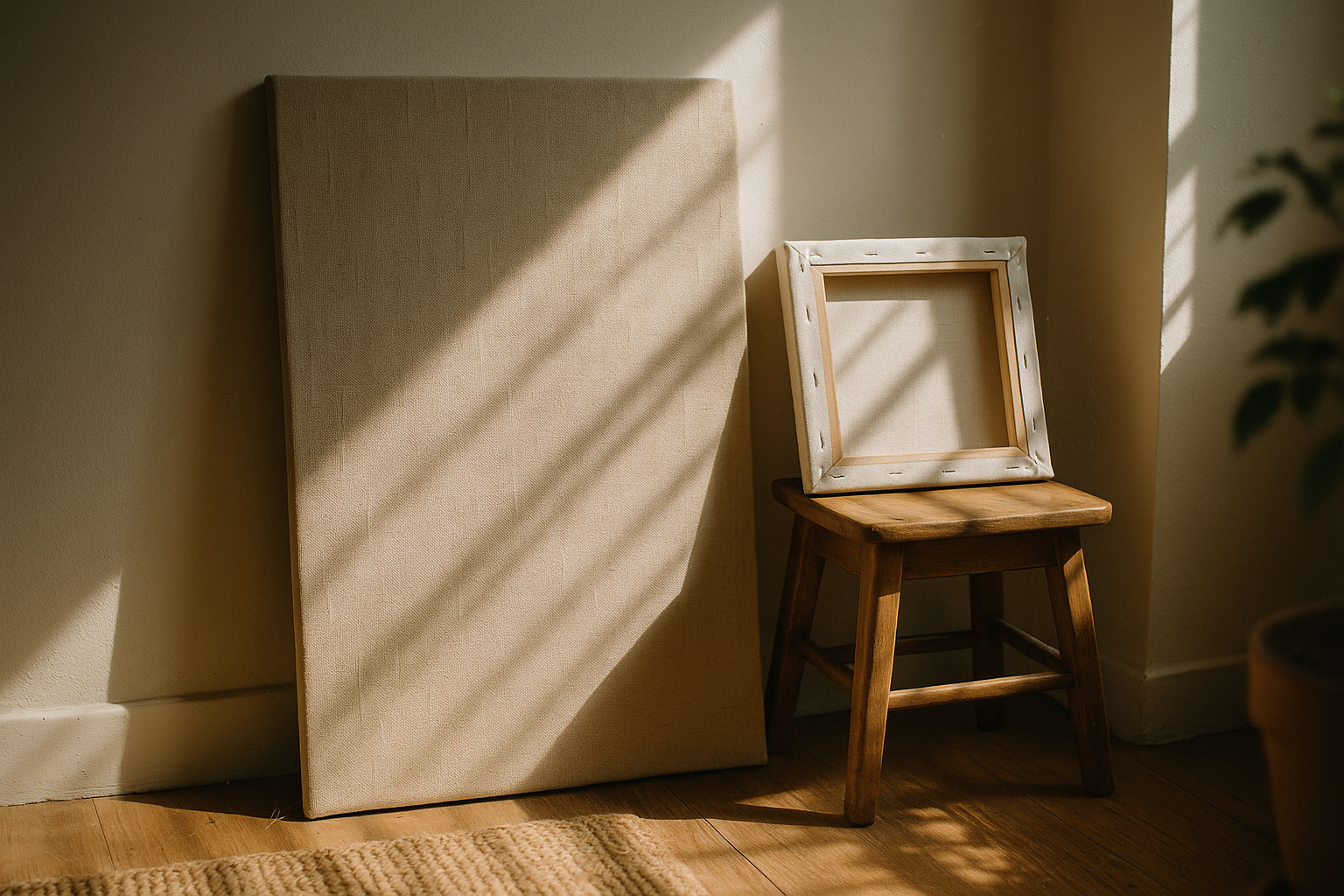
Finishing turns a printed sheet into a ready‑to‑hang object. You’ll choose between several edge styles: a gallery wrap extends the image around the sides for a seamless, modern look; a mirrored wrap duplicates edge pixels to avoid cropping; a solid‑color wrap frames the front face cleanly when you lack bleed. Depth influences presence: roughly 1.5 inches feels sculptural over mantels, while slimmer profiles sit quietly in narrow halls. If you prefer a more traditional presentation, a floater frame leaves a small gap around the canvas, creating a shadow line that visually “lifts” the print.
Mounting hardware should be simple, strong, and appropriate to size. D‑rings with a hanging wire offer flexible placement and reduce torque on the frame; sawtooth hangers suit lighter pieces but limit lateral adjustment. For walls, use anchors matched to material—plastic expansion anchors for drywall, masonry anchors for brick, and wood screws into studs when available. A small spirit level, painter’s tape for marking, and felt pads to protect paint make installs smoother. Environmental care matters: avoid direct midday sun, keep relative humidity around 40–60%, and dust gently with a clean microfiber cloth. Do not spray cleaners onto the canvas; if a protective varnish is present, the manufacturer’s mild‑soap guidance (applied to the cloth, not the print) may be acceptable.
Warping and sagging are fixable if your frame includes corner keys. Light taps tighten the canvas; if creases persist, a brief exposure to a lightly humid bathroom (not wet!) followed by retensioning can help the fabric settle. For heavy‑traffic areas—lobbies, cafés, playrooms—ask about abrasion‑resistant coatings. And if you’re shipping or moving, keep prints vertical, separated by corner protectors or foam, and away from sharp objects that could imprint textures into the surface.
As you evaluate vendors, here’s what to check before you buy so expectations match results:
– Stretcher bar depth, wood source, and whether bars are kiln‑dried.
– Canvas composition (cotton, poly, blend), presence of OBAs, and protective coatings.
– Ink technology and any published lightfastness data for indoor display.
– Edge style options, wrap requirements, and frame compatibility.
– Hardware included, packaging methods, and turnaround plus shipping practices.
Conclusion: Confident Choices for Lasting Canvas Prints
If you’ve made it this far, you now have a practical map for translating images into textured pieces that elevate a room without overwhelming it. You learned how fabric type, coatings, and ink systems work together to drive color and durability, how resolution and aspect ratio shape scale without softness, and how finishing choices influence both style and longevity. You also picked up buying signals—material transparency, careful craftsmanship on the back of the frame, and responsible packaging—that often predict satisfaction months and years after delivery.
For homeowners, this means you can select sizes that breathe in your space, match canvas tone to existing wall colors, and hang safely with hardware that won’t tear out on a busy stairwell. For photographers and artists, consistent color management, documented materials, and supported display recommendations become part of your professional promise to clients. For anyone gifting a print, the combination of tactile warmth, relatively low weight, and approachable price tiers makes canvas a reliable crowd‑pleaser that travels and installs easily.
As you plan your next piece, decide the mood first—subtle matte for calm, richer saturation for impact—then pick materials and finishing that reinforce that intention. Measure your wall, leave breathing room around furniture and fixtures, and stage lighting to graze, not blast, the surface. With a brief checklist, a calibrated file, and sensible handling, a canvas print can carry your story with quiet confidence: approachable, textured, and ready for everyday life. When you’re ready, revisit the outline above, match your project to each decision point, and move forward knowing every choice now has a clear purpose.


